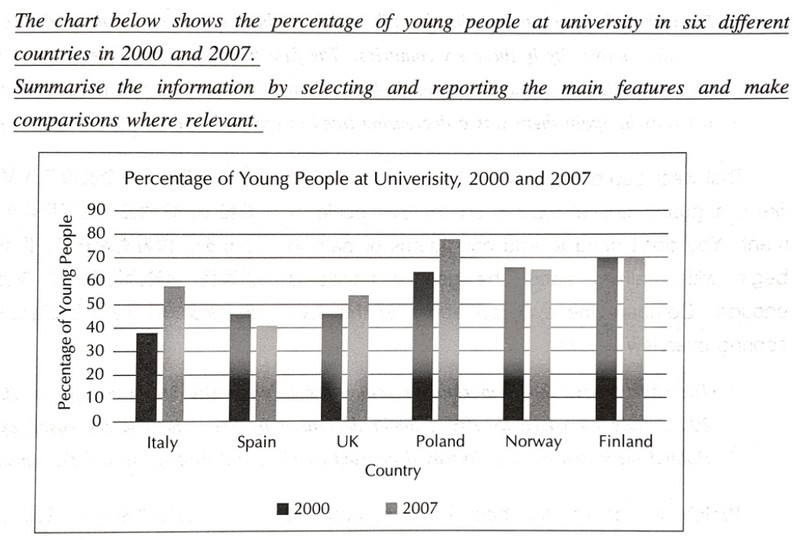
为了全面地理解数据从而写出一个优质的总览(Overview),首先我们需要给数据分组。最好的办法是把每个国家的增长或减少情况标示出来。在分组和寻找规律时,不追求严格一致,大致相同即可。下面是我们将这些数据分组的方法:
UK |
+10 |
increase |
Italy |
+20 |
increase |
Poland |
+25 |
increase |
Finland |
no change |
equal |
Norway |
-1 |
equal |
Spain |
-5 |
decrease |
现在你是否发现分组已经自然形成了。在分组时,使用近似值比盯着原始数据看有效得多。在上表中,我们看到有三个组别,分别是上升、稳定和降低组。有了这三个分组做后盾,我们已经为写出一个优质的总览打好了腹稿,这会让我们的任务完成度得分稳拿6分至重高。总览可以这样写:
From the chart we can see broadly speaking there are three main trends for people attending university in these six countries. The first is an increasing trend which we can see in the UK, Italy, and Poland. In Finland and Norway, there was a decreasing trend in university attendance for young people.
不难吧?一个类似于这样的优质总览会让你的任务完成度得分确保至少6分。作为文章开篇,你不需要插入数据,讨论大趋势即可。
The greatest increase was observed in the percentage of Polish university students, jumping by twenty-five percent to eight percent. That increase was five percent greater than Italy's at twenty percent, which in turn was double of the UK with a ten percent increase.
Levels of Norwegian and Finnish students showed little to no change stalling at sixty-five and seventy percent respectively but still remained amongst the highest in the chart.
为了给这篇文章画上一个圆满的句号,我们需要寻找这个表格中最抓人眼球的特点。
What stands out most is the percentage of Polish students, which exceeded both Norway and Finland to the first place in 2007.


