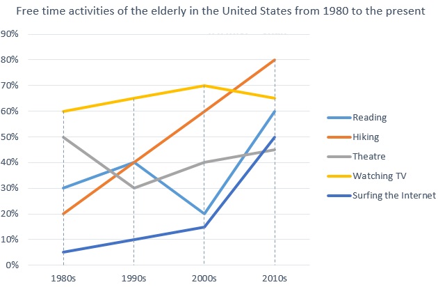
The graph below shows how elderly people in the United States spent their free time between 1980 and 2010.
Summarise the information by selecting and reporting the main features, and make comparisons where relevant.
与其尝试给出图表中所示元素或描述每个细节的原因,不如仅着眼于重要特征。
你的描述应从对对象及其用途的简要概述开始。
然后关注对象的工作方式或对象之间的显着异同。
尽可能改变您的语言,并使用一系列的词汇和结构。
你的描述应以总结性陈述结尾。

Model answer
This graph showsthe kinds of activities done by old people in their spare time, covering a period from the 1980s to now in the United States. We can see thatgenerallythe activities listed have beenincreasing in popularityamongst the elderly, with hiking increasingsteadilythroughout the years, and watching TV being the most popular overall.
In the 1980s, nearly all activities weregrowing in popularity. The only activity which was becoming less popular over these years was going to the theatre. Going to the theatre declinedsteeply from 50% to 30%.
This changed in the 1990s, and going to the theatre became more popular, whereas reading saw adramatic dropin popularity. The number of people doing all other activities increased.
This century, hiking, reading, going to the theatre and surfing the Internet have all been increasing in popularity. However, watching TV has beendecreasingin popularity. Despite this, watching TV is still the second most popular activity nowadays amongst this group. Most elderly people are hiking nowadays in their spare time.
(174 words)


